CSS Grid vs Flexbox: How to decide (with examples)

Should you use a hammer or a screwdriver? Of course that would depend on the job!
The same is true when comparing CSS Grid vs Flexbox. No one layout mode is better than the other. It depends on the task at hand!
This post shows you examples of when to use CSS Grid and examples of when to use Flex before explaining the differences in detail so you can confidently reason about which tool to reach for no matter the scenario.
There is some overlap in what Grid and Flex can do, and that can be super confusing! By the end of this tutorial, you will understand the key differences and know how to pick the most suitable tool for your task.
Flexbox
The history of the flexible box layout module
The idea of flexbox was first discussed by the CSS Working Group sometime before 2008 and the first public draft was published in 2009. In their blog post "Flexbox is Dead, Long Live Flexbox!" Tab Atkins explains that "the original spec was too close of a direct translation from XUL". XUL was Mozilla’s proprietary UI building language, it looks like an alternate universe version of HTML, which is why they were able to base the flexbox spec on it.
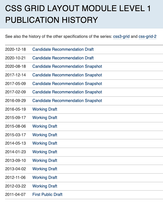
Due to the issues with the first working draft, Tab Atkins rewrote the spec and over the course of 2011 and 2012, publishing four working drafts.
Towards the end of 2012 the spec reached W3C candidate recommendation. This means the spec is stable, supported in browsers, tests are being written for it and there should not be a significant change from this version.
But, there was still performance and efficiency improvements to be made. So over 2014 and 2015 there were three more working drafts. Finally, the spec once again reached candidate recommendation in early 2016.
This is basically the flexbox we know and love today. The reason I covered this history in such detail is to help bring some context to the discussion surrounding layout in CSS. It wasn’t a easy or straight forward path to get to where we are today.
People had reservations around flexbox, because it changed multiple times people felt like they couldn’t use it, because they thought it might change again.
For the same reason people had reservations around grid when it first came out but the process for releasing the grid spec was much different to flexbox so it was needless worry.


Relationship of grid layout to other layout methods
"Flex layout … is designed for laying out more complex applications and webpages."
– W3C Flexbox spec
I covered this history in detail to help bring some context to the discussion surrounding layout in CSS. The path to get here was long and windy. So windy, many developers were reluctant to adopt Flexbox in case it changed again. For this reason, it would be many years until Flexbox became commonplace. Around that time, Grid entered the scene and confused matters further.

Flex and Grid are not the only layout modes! There's flow (aka the default layout mode), tables, floats, multi-column, and the list goes on. There are many different options, and it's all about picking the best one for your use case.
Flexbox was what the web needed, but because it was the first tool of it's kind, developers misunderstood and misused it from time to time. Many layout problems would be better solved with Grid but are hacked together with Flex instead.

The law of the instrument is a cognitive bias that involves an over-reliance on a familiar tool. This perfectly describes most web developers' relationship with Flexbox 🤣.
"If the only tool you have is a hammer, it is tempting to treat everything as if it were a nail"
– A. Maslow
You might think there's no need to learn Grid when you know Flex because they are basically the same.
Ehhh, no, not really. It's important to remember that there will never be one layout mode to rule them all. They all exist for a reason.
When to use Flexbox?
In this section let's look at some common uses for Flexbox:
Responsive navigation bar
An example of distributed navigation:

Split navigation bar
An example of split navigation:

Centring an element
An example of centring an element:

Card layout pushing footer down
An example of a card layout pushing footer down:

Media objects
An example of media objects:

Form controls
An example of form controls:

CSS Grid
Does CSS Grid replace Flexbox?
No! Not at all, they both have their use cases, and they work wonderfully together!
Grid is often seen as the replacement of Flexbox or "Flex 2.0" when it's really another tool for us to utilize.
Web browser developers wrote the specifications for Flex and Grid around the same time, but their journeys from spec to implementation were very different.
Grid makes so many layouts that used to be near impossible a lot simpler.
When to use CSS Grid?
In this section let's look at some common uses for CSS Grid:
Responsive 1-3 column holy grail layout

RAM (Repeat, Auto, Minmax)

Different sized grid items

Overlapping elements

Subgrid (coming soon)
Subgrid is only supported in Gecko (Firefox) and WebKit (Safari), currently in development for Blink/Chromium (Chrome/Edge/Opera/Samsung/etc.):

Masonry layout (coming not so soon)
Masonry layout only supported in Gecko (Firefox) behind a flag.

When to use Grid vs Flexbox?
Now you've seen some examples I hope you'll have a better idea about which tool to reach for and when. Still, it's not always obvious which tool to reach for when you're building a custom UI so let's look at some of the ways you can think about when to use Grid and when to use Flexbox.
One-dimensional versus two-dimensional layout
Flexbox lays out it’s elements in either a row or a column, not both. You can fake it, and get something that looks like a Grid with Flexbox but the Flexbox algorithm doesn’t know about the second dimension.

Grid positions its elements based on both it’s rows and columns.

Content first (intrinsic) or layout first (extrinsic)?
Use Grid when you already have the layout structure in mind, and Flexbox when you aren’t as worried about the layout and just want everything to fit.
Flexbox will listen to it’s content, so it’s content first (intrinsic).


Grid will stick to it’s rows and columns no matter what, so it’s layout first or extrinsic.


If you want you can even make the layout so rigid that it stays exactly the same, though you probably don’t actually want this.

Layout mode cheat sheet
A CSS layout mode, sometimes called layout, is an algorithm that determines the position and size of boxes based on the way they interact with their sibling and ancestor boxes. There are several of them:

| Flexbox | The children of a flex container can be laid out in a column or a row and will automatically flex their size, either growing to fill unused space or shrinking to avoid overflowing the parent. Horizontal and vertical alignment can easily be set, making Flexbox ideal for distributed nav/header, split nav/header, centring an element, card layout pushing footer down, media objects, and form controls. |
|---|---|
| Grid | The children of a grid container are laid out in rows and columns that can be easily defined. This is best when you have a structured layout in mind, for example responsive 1-3 column holy grail layout, RAM (Repeat, Auto, Minmax), different sized grid items, overlapping elements, subgrid (soon!), and masonry layout (not so soon). |
| Multi column | The children of a multi column container are laid out in columns. You are able to set the number of columns and/or the width of columns, as well as how content should flow between columns, the size of columns gaps, and lines in the gaps. This is best when you have lots of text that you want to break into multiple columns. |
| Table | Table layout may seem similar to grid layout but table layout comes with semantics. This is best when you have a structured set of data made up of rows and columns (tabular data). If you have tabular data is is important you use a table and not grid, as the semantics tables have helps screen readers and other assistive technology describe it better. |
| Flow | Flow layout is the default layout mode for most elements. It’s best for laying out document like content, because of how it handles inline and block elements differently. |
| Float | Floats are best for placing media within text. The text is able to wrap around floated elements, like images in a newspaper article for example. |
| Positioned | There are multiple different types of positioned layout. An element can be positioned relative to itself, it’s containing block, or the viewport. This can be used, for example, to position the header to always be at the top of the viewport, to position a chat window in the corner of the viewport, or to position a tooltip next to a button. |
⚠️ Warning
Developers used to push table and float to the limit to layout pages. This is now considered a bad practice, as you should use the best layout mode for the job, reserving table and float for what they were originally designed to do.
The verdict
Layout is the bedrock of CSS. Different layout modes are useful in different circumstances. There's no silver bullet answer to the question of which one you should use.
The most important thing is to know is that they all have their use cases. Take your time to learn about them all, so that you can use the right tool for each situation.
And remember, it’s okay if you can’t remember all this right away. This article isn’t going anywhere, so feel free to come back and use this as a reference when you’re trying to make this tricky decision. We’re here to help!
There is an overwhelming amount of resources available online for learning more about layout. If you're interested in learning more check out Scrimba's Learn Flexbox for free or Learn CSS Grid for free courses, or check out How not to struggle with CSS, with Kevin Powell on the Scrimba Podcast. And lastly, if you're looking for something more comprehensive checkout Kevin Powell's awesome Learn Responsive Web Design course on Scrimba.


