Responsive Web Design: A Complete Guide [2026]
Responsive web design in 2026: media queries, container queries, clamp() fluid type, dvh units, and responsive images, with verified browser support.

![Responsive Web Design: A Complete Guide [2026]](/articles/content/images/size/w1200/2026/03/16.png)
Responsive web design is the practice of building one layout that adapts to any screen, from a four-inch phone to a 34-inch monitor, using flexible CSS instead of separate mobile and desktop versions.
In 2026 that means four tools working together: media queries for page structure, container queries for components, clamp() for fluid type and spacing, and intrinsic CSS Grid for layouts that need no breakpoints at all.
Every section carries working code and support verified in August 2026. A guide that is still breakpoint-first is describing 2015.
What Is Responsive Web Design?
Responsive web design is an approach where a single HTML document adapts its layout, typography, and media to the user's viewport using CSS rules.
Ethan Marcotte named the technique in 2010 around three pillars: fluid grids, flexible images, and media queries. All three survived; the browser now does far more of the work.
Two things belong in every project before the clever parts. The first is the viewport meta tag. Without it, mobile browsers render at a simulated desktop width and shrink the result, which is why a page can look right in DevTools and wrong on a phone.
<head>
  <meta charset="utf-8">
  <meta name="viewport" content="width=device-width, initial-scale=1">
</head>
The second is a short reset that prevents most horizontal-scroll bugs.
*, *::before, *::after {
  box-sizing: border-box; /* padding no longer inflates widths */
}

img, video, svg {
  max-width: 100%;   /* never wider than the parent */
  height: auto;      /* keep the aspect ratio */
  display: block;    /* remove the inline descender gap */
}
What Changed in Responsive Design Since 2020?
Five things changed: container queries replaced media queries for components, clamp() replaced breakpoint type jumps, dvh replaced 100vh, nesting went native, and :has() removed the JavaScript.
Each is now Baseline Widely available, which is a specific claim rather than a vague one. A feature reaches Baseline Newly available when Chrome, Edge, Firefox, and Safari have all shipped it, and Widely available 30 months later, per web.dev.
| Job | The 2020 answer | The 2026 answer | Baseline |
|---|---|---|---|
| Adapting a component to its space | Media queries | Container queries | Widely, Aug 2025 |
| Scaling type across screens | Breakpoint jumps | clamp() |
Widely, Jan 2023 |
| Full-height sections on mobile | 100vh, which clips |
dvh, svh, lvh |
Widely, Jun 2025 |
| Organizing nested rules | Sass or Less | Native nesting | Widely, Jun 2026 |
| Layout that reacts to content | JavaScript toggles | :has() |
Widely, Jun 2026 |
How Do Media Queries Work in 2026?
A media query applies CSS conditionally based on the viewport, usually its width, and remains the correct tool for page-level structural change.
Mobile-first is still the right default: write the small-screen layout as base styles with no query, then add complexity upward with min-width.
/* Base: mobile. No media query. */
.layout {
  display: grid;
  gap: 1.5rem;
}

@media (min-width: 48rem) {
  .layout { grid-template-columns: 2fr 1fr; }
}

@media (min-width: 64rem) {
  .layout {
    grid-template-columns: 3fr 1fr;
    gap: 2.5rem;
  }
}
Media Queries Level 4 added a range syntax that MDN documents as equivalent to the older form.
@media (width >= 48rem) { /* same as min-width: 48rem */ }

@media (30em <= width <= 50em) { /* a band, in one condition */ }
Native nesting is Widely available at 90.81% support, so a query can sit next to the component it modifies. One caution: & is optional for descendant selectors but required for compound ones. Writing .card { &.featured {} } without it means .card .featured, a different selector.
.card {
  padding: 1rem;

  @media (width >= 48rem) {
    padding: 2rem;
  }
}
Pick values by dragging until the layout breaks, not from a device list. The table below is a starting point, not a spec.
| Value | Roughly | Typical use |
|---|---|---|
| 30rem | Large phone | Two-up card rows |
| 48rem | Tablet | Sidebar appears |
| 64rem | Laptop | Full multi-column |
| 90rem | Wide desktop | Cap content width |
What Is a Container Query and When Should You Use One?
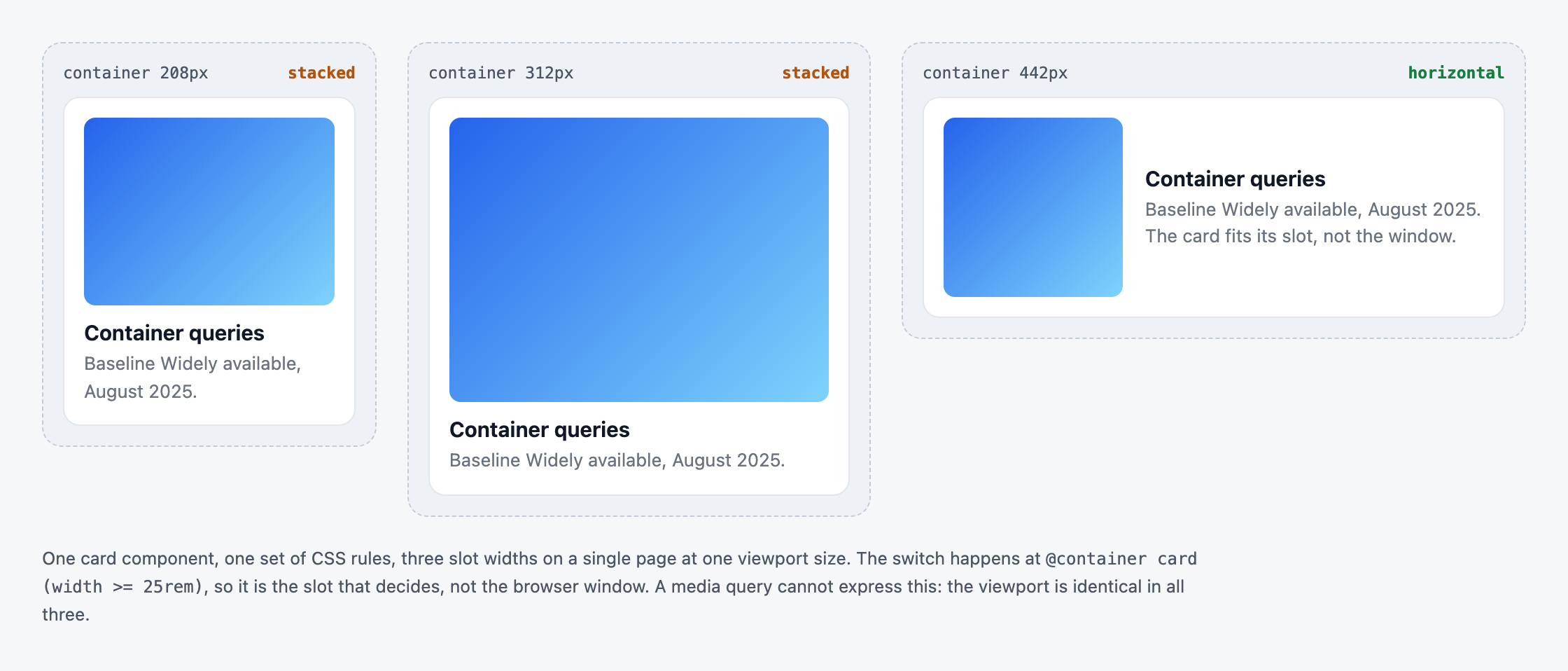
A container query applies CSS based on the size of an ancestor element rather than the viewport, so a component adapts to the space it actually occupies.
This is the biggest change to responsive design in a decade. A card styled with media queries behaves identically in a 300px sidebar and a 900px main column, because the viewport is the same in both. With container queries it fits each.
The pattern has two halves, and the parent half is the one people forget.
/* 1. Declare the parent a container */
.card-wrapper {
  container-type: inline-size;
  container-name: card;
}

/* 2. Query it from inside */
@container card (width >= 25rem) {
  .card {
    display: grid;
    grid-template-columns: 8rem 1fr;
    gap: 1rem;
  }
}
Container query units measure against the container rather than the viewport: cqi is 1% of its inline size (MDN).
.card__title {
  font-size: clamp(1rem, 5cqi, 1.75rem);
}
Container queries have been Baseline Widely available since August 2025, at 92.6% global support, so they are safe to ship. Four limitations to know first:
- A container cannot query itself. You measure an ancestor, so components often need a wrapper they did not previously have.
container-type: inline-sizeapplies size containment. The container can no longer be sized by its children in that axis, which sometimes collapses flex items with no explicit width.- Custom properties do not work in the condition.
@container (min-width: var(--bp))is silently ignored. - Grid items make poor containers. Wrap the content inside the grid item and make the wrapper the container.
Container style queries are a different feature and not ready: Baseline Newly available since May 2026, but they only query custom properties, and caniuse shows 1.64% full support.
How Do You Build Fluid Typography With clamp()?
Fluid typography scales font sizes smoothly between a minimum and a maximum using clamp(), removing the need for breakpoint-based type jumps.
:root {
  /* clamp(minimum, preferred, maximum) */
  --step-0: clamp(1rem, 0.95rem + 0.25vw, 1.125rem);
  --step-1: clamp(1.25rem, 1.1rem + 0.75vw, 1.75rem);
  --step-2: clamp(1.75rem, 1.4rem + 1.75vw, 3rem);
}

h1 { font-size: var(--step-2); }
body { font-size: var(--step-0); }
The same function fixes spacing, where most fluid scales quietly fail. Type that shrinks inside padding that does not looks worse than no scaling at all.
.section {
  padding-block: clamp(2rem, 6vw, 6rem);
  gap: clamp(1rem, 3vw, 2.5rem);
}
Here is the part most guides omit. Sizing text in viewport units alone is a documented accessibility failure: W3C failure F94 explains that viewport units do not respond to zoom, breaking the requirement that text scale to 200%.
Two rules keep a scale compliant: include a rem component so zoom still moves it, and keep the maximum no more than 2.5 times the minimum, the threshold Smashing Magazine identifies as the pass line.
/* Fails: pure vw, and a 4x range */
h1 { font-size: clamp(1rem, 8vw, 4rem); }

/* Passes: rem component, 2.4x range */
h1 { font-size: clamp(1.5rem, 1.2rem + 1.5vw, 3.6rem); }
| Unit | Relative to | Use it for | Watch out |
|---|---|---|---|
rem |
Root font size | Type, spacing, breakpoints | The safe default |
em |
The element's font size | Padding tied to text | Compounds when nested |
ch |
The 0 glyph |
max-width: 65ch |
Varies by font |
vw |
Viewport width | The scaling part of clamp() |
Never alone on font-size |
dvh |
Live viewport height | Full-height sections | Reflows while scrolling |
cqi |
Container inline size | Type inside a component | Needs a declared container |
Which Viewport Units Should You Use on Mobile?
Use dvh for full-height sections and svh wherever content must never be clipped. Both fix the bug where height: 100vh measures a viewport taller than the visible area.
Three prefixes describe three states: sv is the smallest viewport, with the address bar showing, lv the largest, with it hidden, and dv tracks the real value as the bar slides away (MDN).
.hero {
  min-height: 100vh;   /* fallback for very old browsers */
  min-height: 100dvh;  /* the actual value, 92.52% support */
  display: grid;
  place-items: center;
}
dvh is not automatically the right answer, and MDN says so plainly:
Using viewport-percentage units based on the dynamic viewport size can cause the content to resize while a user is scrolling a page. MDN, CSS length units
The practical rule: svh for anything that must never be clipped, such as a full-screen menu, and dvh only where a mid-scroll reflow is cheap.
How Do You Build Responsive Layouts Without Media Queries?
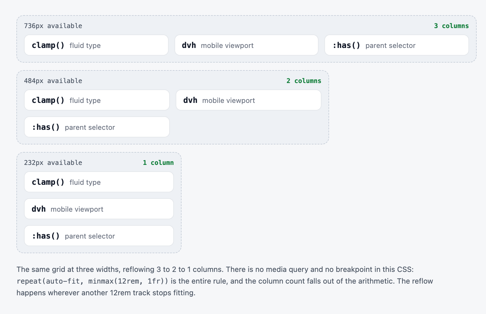
Intrinsic layouts use CSS Grid and Flexbox sizing functions so the browser derives the column count from available space, with no breakpoints written at all.
.card-grid {
  display: grid;
  grid-template-columns: repeat(auto-fit, minmax(min(18rem, 100%), 1fr));
  gap: clamp(1rem, 3vw, 2rem);
}
One declaration produces one column on a phone and four or more on a wide monitor. The min(18rem, 100%) guard stops the track overflowing on narrow screens, the piece most snippets leave out.
auto-fit and auto-fill look identical until items run out. auto-fill keeps the empty tracks, so three cards in a six-track row stay narrow. auto-fit collapses them, so the three stretch to fill the row.
.gallery--fill { grid-template-columns: repeat(auto-fill, minmax(15rem, 1fr)); }
.gallery--fit  { grid-template-columns: repeat(auto-fit,  minmax(15rem, 1fr)); }
Flexbox handles the one-dimensional cases Grid overcomplicates, such as navigation and tag lists. Scrimba's CSS Flexbox guide covers the axis model, and the CSS Grid guide covers template areas.
.nav {
  display: flex;
  flex-wrap: wrap;
  gap: 1rem;
}
.nav > * {
  flex: 1 1 12rem; /* grow, shrink, and wrap below 12rem */
}
Subgrid, Widely available since March 2026 at 90.49% support, fixes the alignment problem intrinsic grids create: card headings and buttons that stop lining up because each card sizes independently.
.card {
  display: grid;
  grid-row: span 3;
  grid-template-rows: subgrid; /* inherit the parent's row tracks */
}
How Do You Make Images Responsive?
Responsive images pair CSS constraints that stop overflow with HTML attributes that let the browser download the smallest file that still looks sharp.
Start by reserving the space. aspect-ratio stops the layout jumping when the image arrives, the most common cause of a poor Cumulative Layout Shift.
.media {
  aspect-ratio: 16 / 9;
  object-fit: cover;  /* fill the box, crop the overflow */
  width: 100%;
}
srcset with w descriptors offers the browser a set of files. sizes tells it how wide the image will actually render, which it needs before layout to choose correctly.
<img
  src="hero-800.jpg"
  srcset="hero-400.jpg 400w, hero-800.jpg 800w, hero-1600.jpg 1600w"
  sizes="(width <= 48rem) 100vw, 50vw"
  width="1600" height="900"
  fetchpriority="high"
  alt="A responsive layout shown at three device sizes">
Omitting sizes is a performance bug rather than a style choice: MDN notes it then defaults to 100vw, so a thumbnail downloads a full-width file. Below the fold, sizes="auto" uses the real laid-out width, and is valid only alongside loading="lazy".
<img
  loading="lazy"
  sizes="auto"
  srcset="thumb-200.jpg 200w, thumb-400.jpg 400w"
  src="thumb-200.jpg"
  width="200" height="200"
  alt="Product thumbnail">
Lazy images still need explicit width and height: an unloaded image measures zero in both axes, so one that never intersects the viewport never loads. Use <picture> when the crop should change, not the file size.
<picture>
  <source media="(width >= 50rem)" srcset="hero-wide.webp">
  <img src="hero-square.webp" alt="Team working at a shared desk">
</picture>
Responsive Design Is Not Only About Width
A layout should respond to user preference and to its own content, not only to viewport size.
Motion preference has been Baseline Widely available since 2020 and costs three lines.
@media (prefers-reduced-motion: reduce) {
  *, *::before, *::after {
    animation-duration: 0.01ms !important;
    transition-duration: 0.01ms !important;
  }
}
Color scheme pairs with custom properties, so one variable block flips the page. Scrimba's CSS animations guide covers the motion side, and its Learn CSS Variables course works through the scoping and theming patterns in more depth.
:root { --bg: #fff; --fg: #111; }

@media (prefers-color-scheme: dark) {
  :root { --bg: #111; --fg: #f5f5f5; }
}
The :has() selector, Widely available since June 2026 and the most-named favorite new feature in the State of CSS 2025 survey, lets a layout respond to what it contains without JavaScript.
/* A card that contains an image gets a two-column layout */
.card:has(> img) {
  display: grid;
  grid-template-columns: 1fr 2fr;
}
One caveat on typography: text-wrap: balance evens out heading line lengths and is Baseline Newly available, so it is a safe enhancement. Its sibling text-wrap: pretty is still Limited, with no Firefox support.
Which Responsive Technique Should You Use?
Use all five. Each responds to a different signal, and a production layout usually needs three or four of them working at once.
| Approach | Responds to | Best for | Limitation | Baseline |
|---|---|---|---|---|
| Media queries | Viewport size | Page structure, sidebars | Blind to a component's context | Widely, 2012 |
| Container queries | An ancestor's size | Reusable components | Needs a declared container | Widely, Aug 2025 |
clamp() scale |
Viewport, continuously | Type, spacing, padding | Fails WCAG without a rem part |
Widely, Jan 2023 |
| Intrinsic Grid | Available space | Card grids, dashboards | Little control over exact columns | Widely, 2017 |
| Flexbox wrap | Content width | Navigation, tags, toolbars | One axis at a time | Widely, 2013 |
Reserve media queries for the two or three genuinely structural shifts and let the other four carry the rest.
How Do You Test a Responsive Layout?
Drag the viewport in DevTools rather than clicking device presets, then confirm the result on one physical phone at 200% browser zoom.
- Open device mode in DevTools and drag the edge slowly. Presets tell you the layout works at 390px. Dragging tells you it breaks at 412px.
- Set breakpoints where the drag revealed a problem. A breakpoint taken from a device list is a coincidence.
- Record a page load in the Performance panel and check Cumulative Layout Shift. Missing
width,height, oraspect-ratiois almost always the cause. - Test
dvhon a physical phone. Emulators do not slide an address bar, so the bug those units exist to fix is invisible in DevTools. They also miss touch targets and real font rendering. - Zoom to 200% and confirm text still scales, which catches the
clamp()trap in seconds.
Where to Learn Responsive Web Design
| Resource | Provider | Price | Format | Best for |
|---|---|---|---|---|
| Learn Responsive Web Design | Scrimba | $24.50/mo annual | Interactive scrims, 15.1 hrs | Kevin Powell, four full builds |
| Responsive Web Design certification | freeCodeCamp | Free | Project-based | A free certificate |
| Responsive Design module | MDN | Free | Reference docs | Checking the standard |
| Kevin Powell on YouTube | YouTube | Free | Video tutorials | Single-technique deep dives |
Scrimba's Learn Responsive Web Design is a 15.1-hour Pro course taught by Kevin Powell across six modules and 126 lessons, building four complete layouts: a blog, a landing page, a banner, and a company website. The scrim format suits this topic unusually well, because learners resize the viewport and edit CSS inside the lesson.
Its scope stops short of the newest layer: it covers CSS fundamentals, responsive-first thinking, advanced Flexbox, and CSS Grid, but not container queries, JavaScript, or frameworks. The course also sits inside The Frontend Developer Path, an 81.6-hour Pro path curated with Mozilla MDN. Scrimba has been MDN's recommended course partner since July 2024.
A layout that reflows correctly is not automatically usable: low-contrast text and unlabeled form controls survive a resize untouched. Scrimba's Learn Accessible Web Design is a 96-minute Pro course with Fredrik Ridderfalk covering contrast, the accessibility tree, WCAG levels, semantic HTML, and ARIA.
Scrimba Pro costs $24.50/mo on the annual plan ($294/year), with regional pricing, student rates, and promotions bringing it lower for many learners. Completion certificates are included, on free courses too. Readers who need fundamentals first can start with the best HTML and CSS courses for beginners or the wider CSS course roundup.
Practice Projects
Each project forces one technique and has a test you can run.
- Fluid Portfolio Page. A
clamp()scale and oneauto-fitgrid. It passes when the page reads cleanly at 320px and survives 200% zoom. - Sidebar Dashboard. Container-query widget cards, dropped into both the sidebar and the main column. If the component needs override CSS in either slot, the query is wrong.
- Product Grid.
auto-fitplussrcsetandsizes. Check the Network panel: a phone should pull the small file. - Full-Bleed Hero. Build it twice, in
svhand indvh, then open both on a real phone.
Frequently Asked Questions
What is the difference between container queries and media queries?
Media queries respond to the viewport, so every element sees the same condition. Container queries respond to an ancestor's size, so a component adapts to the space it occupies. Use media queries for page structure, container queries for reusable components.
Are media queries still relevant in 2026?
Yes. Container queries complement media queries rather than replacing them. Media queries remain the right tool for page-level structural changes, such as moving a sidebar below the main content. Production sites use both.
Should I design mobile-first or desktop-first?
Mobile-first. Write the small-screen layout as base styles with no media query, then add complexity upward using min-width queries. This produces less CSS and means phones download the simplest version of the stylesheet.
What breakpoints should I use for responsive design?
Choose them by dragging the browser until the layout breaks, rather than copying a device list. As a starting point, 30rem, 48rem, 64rem, and 90rem cover large phones, tablets, laptops, and wide desktops. Device widths change yearly; content breakpoints do not.
Why does 100vh not work correctly on mobile?
Because vh measures the viewport as if the address bar were hidden, so a 100vh section extends below the visible area. Use 100dvh for a value that tracks the bar, or 100svh when content must never be clipped.
Key Takeaways
- Responsive web design in 2026 layers four tools: media queries for page structure, container queries for components,
clamp()for fluid type, and intrinsic Grid for breakpoint-free layouts. - Container queries have been Baseline Widely available since August 2025 at 92.6% support, so components adapt to their own context rather than the viewport.
- The viewport meta tag and a short reset prevent most responsive bugs before any layout code is written.
dvhfixes the100vhmobile bug, but MDN warns it can reflow mid-scroll, sosvhis safer where clipping is unacceptable.- A
clamp()scale needs aremcomponent and a maximum no more than 2.5 times the minimum, or it fails WCAG Success Criterion 1.4.4 under zoom. - Omitting
sizeson asrcsetimage makes the browser assume100vwand fetch a full-width file for a thumbnail. - Scrimba's Learn Responsive Web Design is 15.1 hours with Kevin Powell, on Pro at $24.50/mo annual; freeCodeCamp's v9 certification is the free alternative.